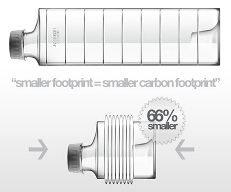
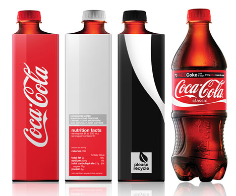
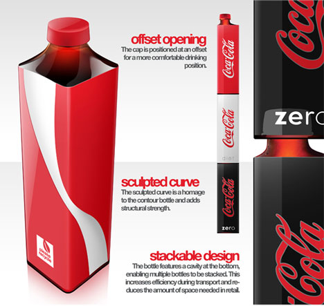
CCS student Andrew Kim’s Coke bottle redesign is an ambitious take on the iconic bottle, going square in the name of eco-friendliness. The new bottle shape would take up far less space in shipping pallets per bottle, and a push-up in the bottom large enough to accommodate the cap of the bottle beneath it would enable stacking. Said cap is offset for better drinkability.
Another interesting design feature is that underneath the label, the bottle is ribbed so that it can compress like an accordion, taking up even less space when it’s time to go into the recycling truck.
As a former structural package designer myself, my first thought was that the strength needed for stackability wouldn’t jive with a crushable bottle, but then I realized the bottle could be designed so that it’s strong when surrounded on all sides–like when they’re being shipped en masse–but collapsible when the bottle is alone, absent the pressure of surrounding bottles. Good stuff, and even more impressive considering Kim is a freshman!
HIT FROM: Core77.com








Looks like something that would be in Japan already, and take a year or two to come to the states. Brilliant.